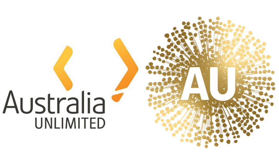
As part of a $10 million rebranding project that literally no-one asked for, Australian Minister for Trade, Tourism, and Investment Simon Birmingham has released images of the new and improved Australia Unlimited logo. To say “bad timing” would be an understatement.
The national trade body have swapped the humble two boomerangs for an image straight out of the COVID news gallery. While the logo is supposed to represent a wattle flower, Aussies everywhere just aren’t having it.

The Government have replaced a perfectly fine logo with the most viral looking wattle you’ve ever seen.
In an ensuing national frenzy; media outlets, civilians, and even politicians have all mistaken Australia Unlimited for the iconic Australia Made kangaroo. Never fear, the kangaroo isn’t going anywhere, and is even getting an upgrade.
“Australia is inconsistent with its use of multiple logos, colours and narratives, which dilute our brand offering and confuse our potential audiences,” the Nation Brand Advisory Council reported about the change.
“This is why we have modernised our national colour scheme with the use of a deep green and actual gold, rather than yellow.”
Although, it does leave you to wonder: how did this happen? Nothing about this virus looks remotely flower-like to me. While most Australian states and territories are slowly returning to normality, Victoria are currently wrapped in a second spike of COVID-19. Surely the first instinct during a pandemic is to not draw up a logo that looks infectious in any way.
Supposedly, the rebrand is intended to “bring some unity to the way in which we present the nation to the world,” Minister Birmingham explained.
“The Nation Brand developed by Australian business leaders will simply seek to bring some consistency in how different government agencies, industry bodies, states and territories present themselves at international trade shows and similar events.”
I can’t believe they have changed the Australian made logo to look like this, it looks like a virus. I will be writing to the Australia’s Nation Brand Advisory Council & Trade Minister @Birmo to reinstate the Kangaroo! pic.twitter.com/KzfMebQ9wR
— Mark Coure MP (@markcourelive) June 30, 2020


