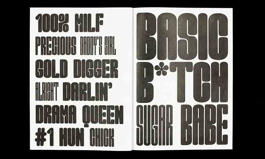
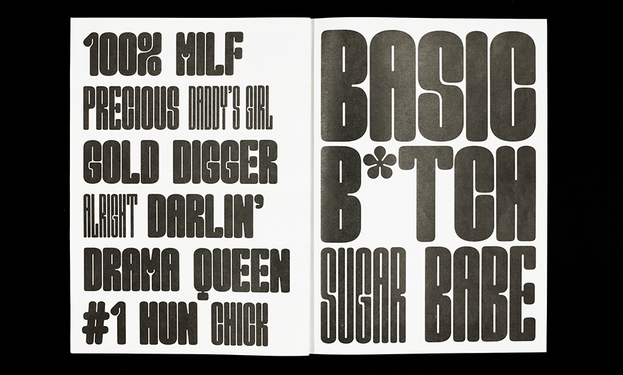
Marion Bisserier’s new display typeface spells out all the shit that women hate hearing. “Darlin’,” “bimbo,” “gold digger,” “damsel in distress,” “sugar babe,” the project reads.
The typeface is reminiscent of the smooth curves of the 70s, with an “M” that takes the shape of a pair of female legs. The narrow holes inside the letters look like the narrowed eyes of cynicism.
Marion Bisserier ‘s new typeface is an unapologetic response to the lack of female visibility in graphic design.
The graphic designer, who has worked at Pentagram and A Practice For Everyday Life, observes the gender disparity in design. “Although there is an equal number of women and men working in type design,” she said in an interview, “there isn’t enough public credit given to women in type.”
She’s right. Helvetica, Baskerville, and Times New Roman are getting all the glory as the three most popular typefaces of all time. And they’re all designed by men.
Her project description reads:
“Good Girl addresses the issue of female visibility within the field by exploring the occupation of space both in typographic form and political expression.”
The project is presented on her own website, laid out in baby pink and daring verses. By collectively listing the clichés and sexist slurs, Bisserier not only ridicules and trivialises, she encourages us to own our stereotype.
A typeface “not afraid to take some space,” it utilises upright forms and as much positive space as possible. Bisserier successfully embodies the tension of breaking the mould whilst still having to fit within traditional type requirements.
Marion has received praise from AIGA Eye on Design and It’s Nice That and from me, as well, right now. She’s a great type designer who happens to be female. Period.