Apogee has earned plaudits for decades for its pro-grade converters. Can the company bring that elite level to the home studio with its Symphony Desktop?
Apogee has an unrivalled reputation for fidelity in analog to digital conversion. With the Symphony Desktop, Apogee aims to bring that quality to a desktop interface that’s more likely to be used in the home studio, rather than a multi-million dollar facility.
If you’ve been in a professional studio in recent decades, you might have seen Apogee Symphony converters doing their thing quietly in a cupboard to the side of the control room. The desktop version of this interface puts the hallowed line front and centre while providing everything a home studio might need, and more. Engineering the Sound took a closer look.
First impressions
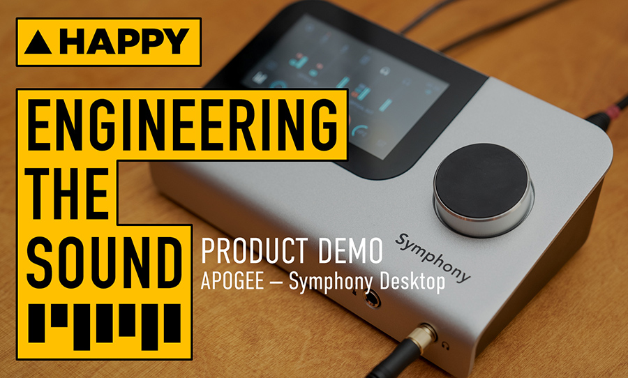
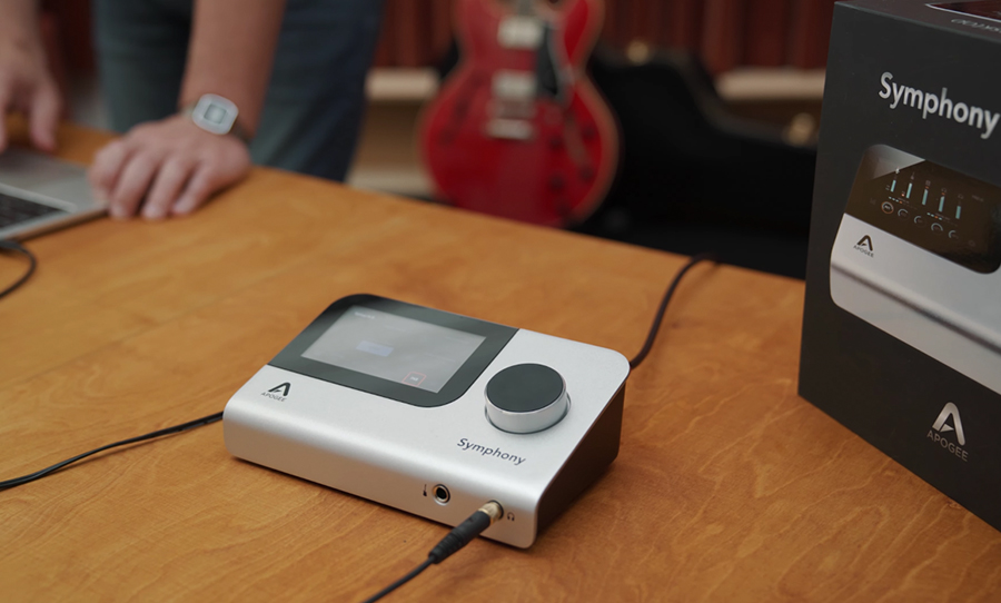
The Symphony Desktop looks like a solid slab of aluminium and it certainly cuts a stylish silhouette on the desktop. There’s only one knob on the face of the unit. On the front edge, headphone output 1 and the Hi-Z input reside. On the back are two combi-jack inputs, main monitor outputs, a secondary headphone output, SPDIF connections for optical expansion, USB connection to your computer, USB host for uploading firmware and power.
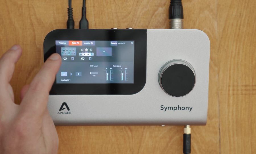
But what if you need to go a little deeper into the settings? This is when you’ll need to engage the touchscreen.
Functionality
The touchscreen is the portal to gain, preamp choice, routing (there are 10 inputs and 14 outputs of simultaneous playback on offer), and more. And before all you software-phobic hardware-only types break out in a cold sweat, never fear: the touchscreen on the Symphony Desktop is intuitively designed and exceedingly simple to use.
Selecting channels, setting gain structure, and preamp choices (including the AP-66 — a homage to the Neve 1066 pre; the AP-57 — which cops the tone of a ’50s Ampex 601; and the excellent, crystal clear SD-MP: the Symphony preamp), is a piece of cake via the touchscreen. The screen itself more-or-less functions as the buttons while you use the knob to do all the adjusting. When you get used to this marriage of the digital and mechanical, it all makes sense.
Overall, the touch screen is a winner because of one simple fact: you don’t have to perform all these tasks on your computer. No more flicking between the DAW screen and your interface’s accompanying app. In fact, I’ve run the Symphony Desktop on several sessions and haven’t had to resort to the app once — everything I need (including routing the secondary headphone output to a separate cue send in the DAW) is accessible on the unit itself.
Apogee has taken this ease of workflow to another level with its DualPath linking system. This means you can run plugins (Pultec EQs, an LA-3A emulation, and some additions courtesy of Apogee’s ongoing collaboration with Bob Clearmountain) using the unit’s DSP for low latency monitoring, as well in your DAW for playback while keeping the same settings, without having to switch between two systems.
Sound
The Symphony line speaks for itself. Flexible, powerful, reliable, with a tone that could be best described as immaculate. That said, its preamp emulations are faithful to the vintage gear that inspired them. The AP-66 delivers on that famous Neve cut-through and punchiness, whereas the AP-57 dishes up a valve-like character, rich in harmonic flavour and fuzzy around the edges when pushed.
So who’s the Apogee Symphony Desktop for? Well, there’s no getting around its premium price tag. At over two grand Australian, it’s expensive for a desktop interface. But what do you get? A highly intuitive workflow, rock-solid reliability, and simply unrivalled sound quality.
For more, visit Apogee.
