“It’s surprisingly easy to turn most type forms into penises, vaginas and breasts.”
I don’t think truer words have ever been spoken.
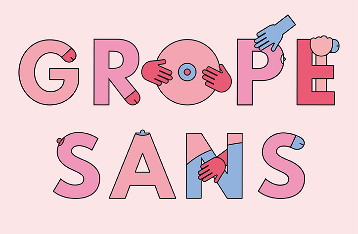
Bompas & Parr are a London-based studio dabbling flavour-based experience design, culinary research, architectural installations and contemporary food design. They also just released a brand new, very original typeface for Valentine’s Day.
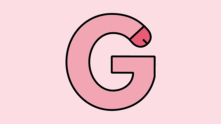
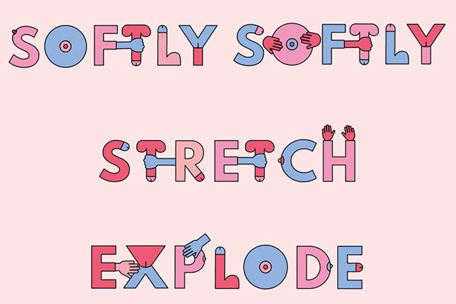
It’s called Grope Sans and it’s the smutty typeface that proves drawing dicks and boobs never gets old.
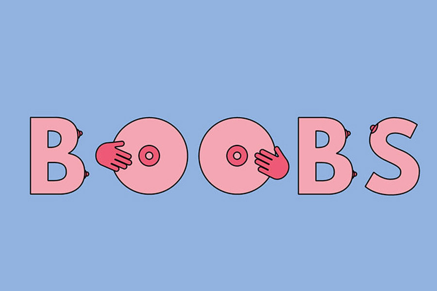
How funny are dicks and boobs? Grope Sans is the smutty typeface that proves drawing genitals never gets old.
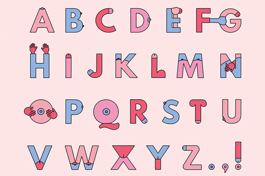
The typeface was inspired by Grope Mountain – an installation by Bompas & Parr which features a climbing wall with genitals in place of traditional indoor rock climbing handholds: curved letters are adorned with nipples, crevices are turned into vaginas and long, straight lines are, of course, penises.
“There are up to three variations on each letter,” said the studio’s graphic designer Flo Fairweather, “so an even representation of male and female parts can be achieved with every word. Every minor adjustment I made was laughter-inducing.”
The typeface was specifically created for the for Grope Mountain installation (which is in Liverpool) and is used for event signage, maps and hand-outs to help climbers navigate the installation.
See more below.
[via It’s Nice That]

