Even if you’ve never realised it, there’s an art to making volume sliders. If anything, you do become aware of them when you’re faced with the tragically bad examples – looking at you, screen-destroying, non-transparent iPhone volume indicator.
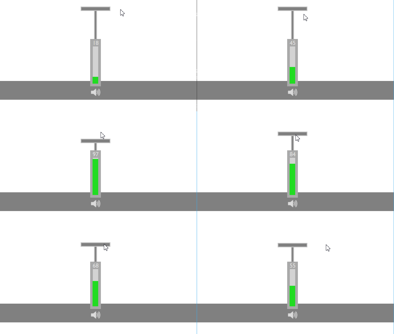
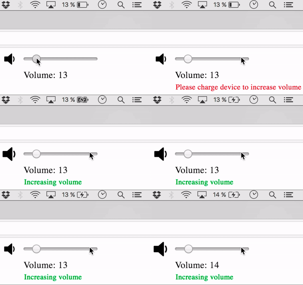
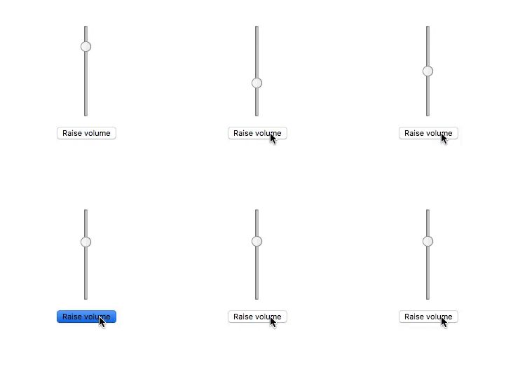
What started as a simple post on subreddit r/programmerhumor has spun out of control in a competition to create the world’s worst volume slider. Everything from minigames to a roll of the dice has been integrated into these infuriating sliders… I mean you just have to see them.
What would you call the world’s most asinine volume slider? A group of weary Redditors are climbing over one another to claim the title.
Here’s the cheeky post that started it all:

And without further ado, here are some of our favourites:



Via Designer News.
