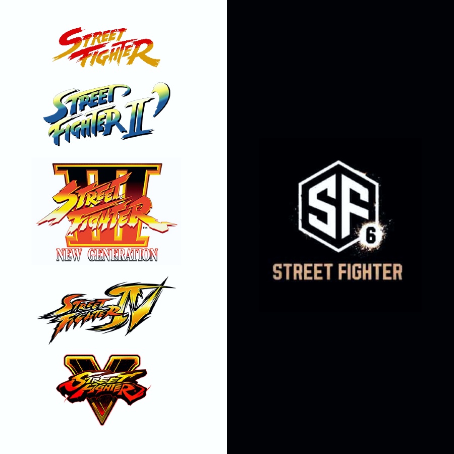
Capcom just announced Street Fighter 6, and though the hype for the game is genuine, community members are very underwhelmed by the new logo.
Six years after its predecessor, Street Fighter 6 was announced by Capcom via an incredibly bland countdown website. On top of that, Capcom Fighting Collection was also announced, seeing ten classic titles, such as Darkstalkers, being brought into the next generation of gaming.
Once the adrenaline levels among fans started to subside, community members began to notice and comment on the simplistic nature of the game’s new logo. Many turned to Twitter to share their unimpressed views and joke about the new direction.
This logo looks like if Street Fighter got six emails. pic.twitter.com/zITUaVCqHj
— Brian Altano 🍕 (@agentbizzle) February 21, 2022
Street Fighter is notorious for it’s iconic logo and this is new logo is many degrees of separation removed from what it was. I’m not a Street Fighter fan myself but I think the new logo looks like something a new stream buys from Fiverr.
Upon further investigation of the image, some fans could’ve sworn that they had seen it somewhere before. And they potentially had.
Initially pointed out by Aurich Lawson on Twitter, the Creative Director for Ars Technica, the logo seems to match an Adobe stock image available for AUD 87.99 and designed by user xcoolee.
The new Street Fighter 6 logo is $80 on Adobe's Stock site
I don't even know what to say. I knew it was generic but I didn't realize it was this bad. They searched for "SF" on a stock logo site and rounded a couple corners and added the 6
I cannothttps://t.co/SViXFjElou pic.twitter.com/yOzYePaYfV
— Aurich (@aurich) February 21, 2022
During a conversation with IGN, xcoolee confirmed that they had created the stock image. They also noted that they have reached out to Capcom to sell the exclusive rights to the image, which they may have already used.
At the time of writing this article, Capcom hasn’t commented on the logo design or offer by xcoolee.