Italian graphic designer Emanuele Abrate has decided that enough is enough, taking it upon himself to redesign some of the world’s worst logos.
A good logo is a pivotal part of business success, and unfortunately, these brands seem to have missed the mark.
Italian graphic designer Emanuele Abrate has remade the world’s worst logos.
He came up with the idea after spending years coming across logos with less than satisfactory, unclear messaging. Check out the pictures and Abrante’s explanation for each below:
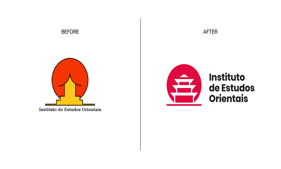
“This is probably the most famous example of a logo with an ambiguous message. The shapes of the pictogram are simple and essential, but maybe too much? I wanted to keep the concept unchanged, working on the negative space and enhancing the figure of the pagoda.”
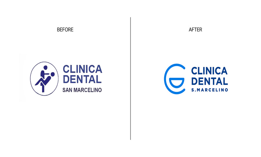
“A dentist or a seducer? The logo of this dental practice is quite ambiguous, so I decided to come up with a new, simpler and less descriptive solution.
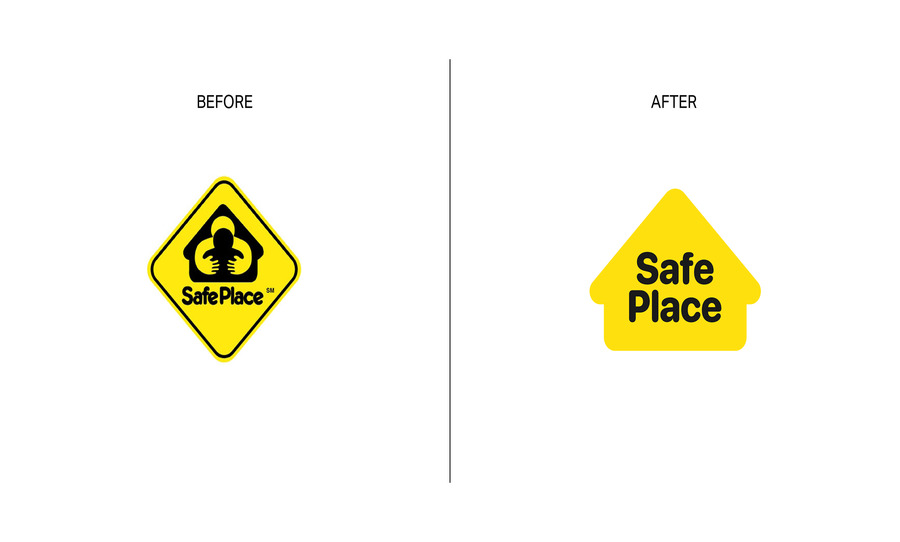
“There is really too much in this logo: shapes inside one shape inside another shape. Also, the main figure instead of conveying confidence appears a little disturbing.”
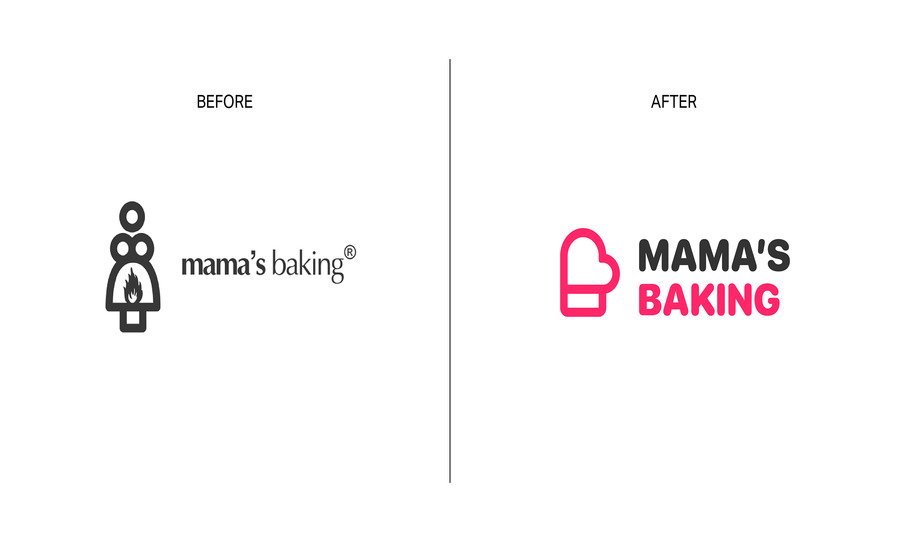
“For this logo I wanted to develop a completely new concept, letting myself be inspired by the figure of the mother who cooks with passion: I can imagine her removing the steaming pan from the oven.”
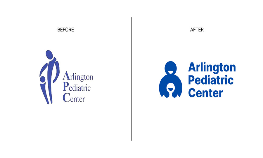
“The new logo starts from the same concept, but reinterpreting it in such a way as to remove any misunderstandings and give a sense of greater confidence.”
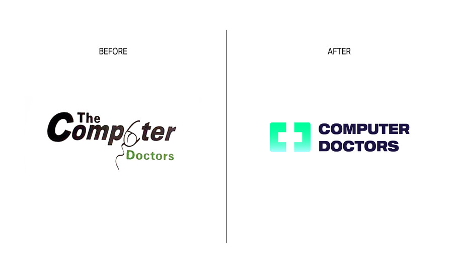
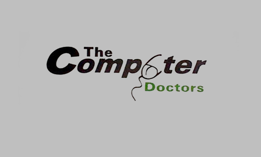
“Nothing could be saved of this design, so, I wanted to work on a completely new concept that would combine the world of technology and the world of healthcare.The idea behind the new logo was to start from the shape of a monitor to insert a cross in the negative space and at the same time enhance the initial letters C and D.”
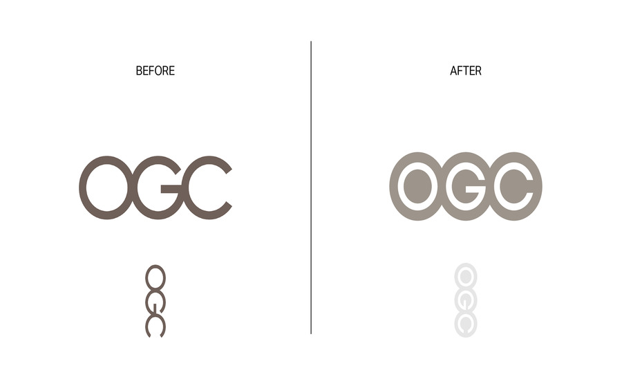
“OGC is a logo that apparently has nothing wrong with it: it is an acronym with three sans serif circular letters very close to each other, but by rotating the logo you can see a rather embarrassing figure (definitely not a good move for a government agency).”
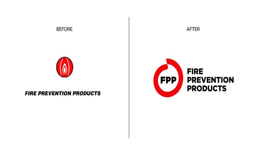
“This logo suggests that something “down there” is on fire, uh là là! Not quite the sense of protection one should expect. That’s why I decided to develop a new concept starting from circular shapes that enclose the figure of a flame in the negative space. “
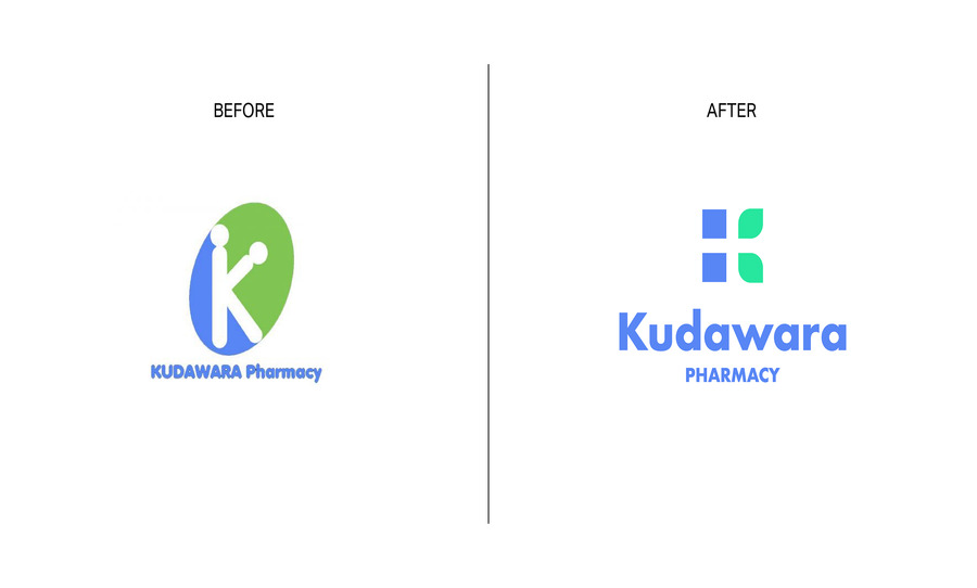 “The problems of this logo are many: poor use of typography, disproportionate elements and last but not least a use of shapes that creates an ambiguous message.I wanted to delete everything, keeping only the use of the K as lettermark and a similar color palette.”