Apple’s latest design update is here, and while it won’t beam you anywhere, it’ll make your phone feel a little bit nicer to use
Announced in Cupertino this week, Apple introduced a new look that stretches across every major platform — iOS 26, iPadOS 26, macOS Tahoe 26 (yes, they named it after a holiday spot), watchOS 26, and tvOS 26.
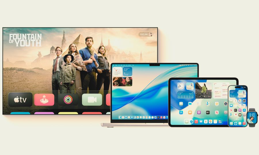
The star of the show? Liquid Glass — a translucent, responsive design material that adds a subtle shimmer and softness to the way your device looks and moves.
![]()
According to Apple’s VP of Human Interface Design, Alan Dye, this is “our broadest software design update ever,” and it shows. Buttons, sliders, sidebars, and menus now shift and respond with a bit more ease and visual flow.
The idea is to keep things intuitive and familiar, while quietly dialing up the polish.
Rather than reinventing the wheel, Apple’s leaned into its strengths — thoughtful visuals, tidy interfaces, and a sense that everything just fits.
With Liquid Glass, elements like the lock screen clock, tab bars, and control centres gently adapt to what’s around them — whether it’s light, dark, colourful, or muted. It’s clean and fluid, without drawing too much attention to itself.
On iPhone and iPad, navigation controls now shrink or expand depending on what you’re doing, keeping your content front and centre.
On Mac, the Dock and widgets can be dressed up in new tints, light or dark modes, or a pared-back transparent look that makes the screen feel more open.
Even the Apple Watch is in on it — the new design touches show up in tiny ways that make swiping and tapping feel a little less clunky.
It’s not a dramatic overhaul, and it’s not pretending to be. Apple’s playing a long game here: small, consistent tweaks that make their software feel more unified across all devices.
It’s about smoothing out the edges — literally — and creating a bit more visual breathing room.
Developers are getting new tools too, with updated APIs for SwiftUI, UIKit, and AppKit so third-party apps can keep up with the new aesthetic.
Expect more apps to start looking and feeling just a bit more “Apple-y” in the months to come.
So no, this isn’t the next frontier of sci-fi interfaces — but it is a nice reminder that design doesn’t have to shout to be effective.
Sometimes, making things just feel better is enough.
Check it out in more depth here.