Have you ever wondered what our most popular apps would have looked like in the 1980s? Me neither, but this artist has given it a lot of thought whilst in isolation and has come up with quite the cool collection.
Argentinian graphic designer Luli Kibudi has given these well-known apps a retro remake with an ’80s aesthetic and we kinda dig it.
Argentinian graphic designer Luli Kibudi has recreated some of our favourite apps with a retro spin in a series titled Once Appon a Time.
This trip back in time takes more expertise than one might think, with each design taking up to three hours to complete. That is after all the time and effort it took to think up the plans for each logo and how to recreate them.
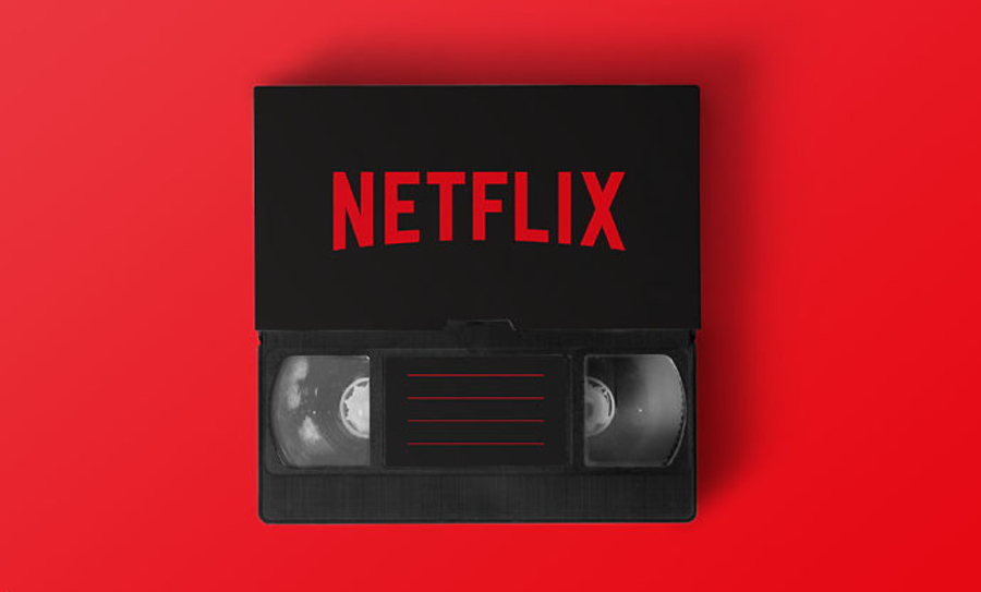
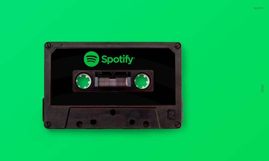
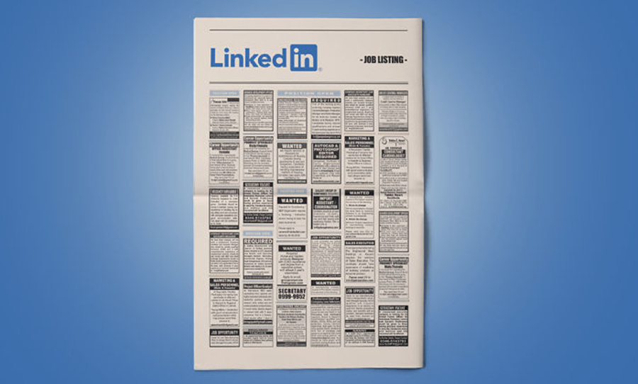
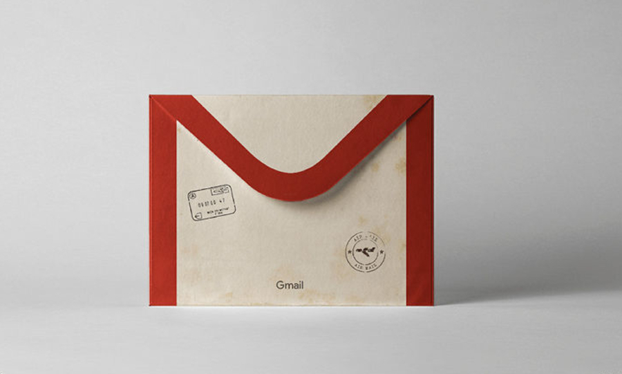
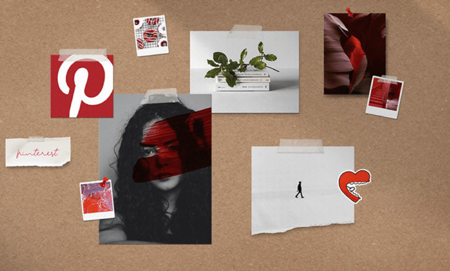
“It depends on the simplicity,” Kidbudi described in an interview with Bored Panda. “The ones that I spent less time on are the simpler ones, like Spotify and Netflix (half an hour). The more complex ones were Linkedin, Pinterest and Gmail, since I had to spend a few hours retouching them (3 hrs).”
We appreciate the nostalgia none the less – it seems some of us are more productive than others when trapped in isolation. Check out the full collection of Kibudi’s series of apps below, or head to her Behance.
2. Microsoft Word 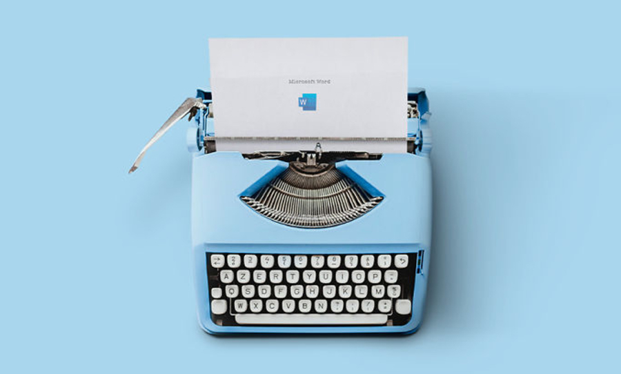
2. Wikipedia 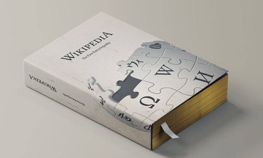
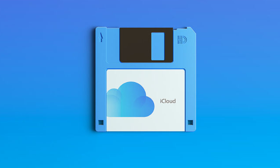
3.iCloud
4. Facebook

5. Gmail
6. Pinterest
7. Netflix